The Process
Given the fact that AdHub is a platform for individual developers and advertisers, the majority of the users were new to the B2B world.
I was new to this concept as well and I had to spend a considerable amount of time learning the system before I could define what had to be done in order to improve the usability of the service.
User Flow Analysis
I started off by analyzing the user flow of the ecosystem.
1. I noticed that first time visitors follow a linear process of signing up and setting up their platform environment.
I thought that a step-by-step user guide would help these users overcome the high barrier to entry.
2. From the second visit on, users begin their daily activity by checking the stats on the dashboard.
So I decided to set up all the necessary menu to be accessible from the dashboard.
3. From a business stand point, I also placed various cues here and there to get advertisers and publishers to try the opposite role and expand the horizon of their business.
I also place share buttons on each step to encourage social motivation.
Contextual User Guide
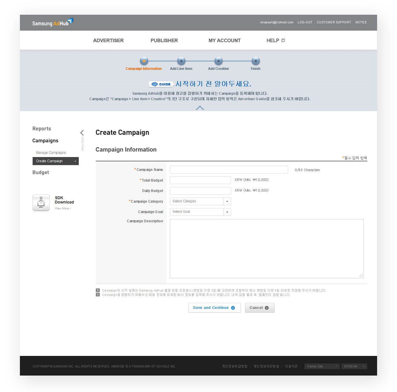
A step-by-step walk-through guide was designed with tips popping up in bubbles to point at specific action items.
This collapsible user guide can be minimized to a small section with just the progress bar if the user wants to focus on the work space.
I also placed a Help module on the left hand side to for users to check out relevant tips or search for a specific question.
Below is the launched page:
Dashboard UI
The dashboard was designed so that all relevant menu could be accessed on one screen.


