1. Revamping the platform
Expanding the card swipe-up feature to the next level
Objective #1 : Increase traffic to the app
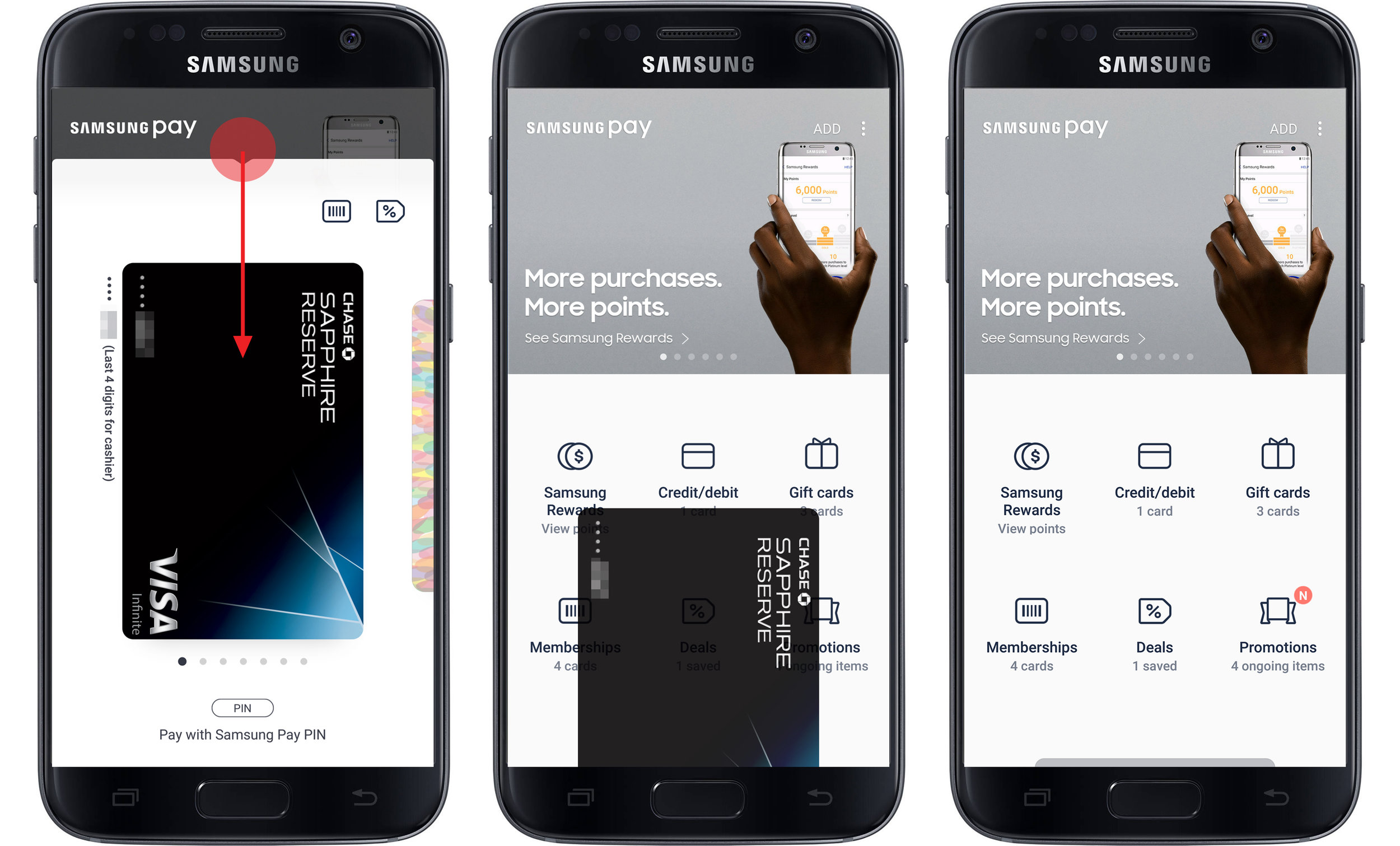
Before, the Favorite Cards panel and the Samsung Pay app were treated as separate entities. The Favorite Cards was a shortcut accessible on a swipe-up, and the app itself was accessible through the app icon on the device Home screen.
In the attempt to increase exposure of the variety of new features on Samsung Pay, it was crucial to drive more people into the app.
My team came up with an idea to merge the Favorite Cards panel and the app. Now when user swipes up on any screen, it would pull up Favorite Cards panel with the app attached behind. When user swipes down on the panel to close, it wouldn't close the service, but reveal the app sitting behind the layer. This was a way to draw more users into the app by utilizing their existing behavior.
To ensure this change doesn't come as a surprise, we tried to provide a hint at what's going on in the background by fading in the visuals of the app behind the Favorite Cards panel as it is being pulled up.
Objective #2 : Gain scalability for an expanding range of features
The team went through numerous iteration of user tests and ideation sessions to figure out what the current tab + card stack layout should evolve to, and came to a conclusion that a grid wall would best accommodate the different set of features for each market and react to the features updating at tiered phases.
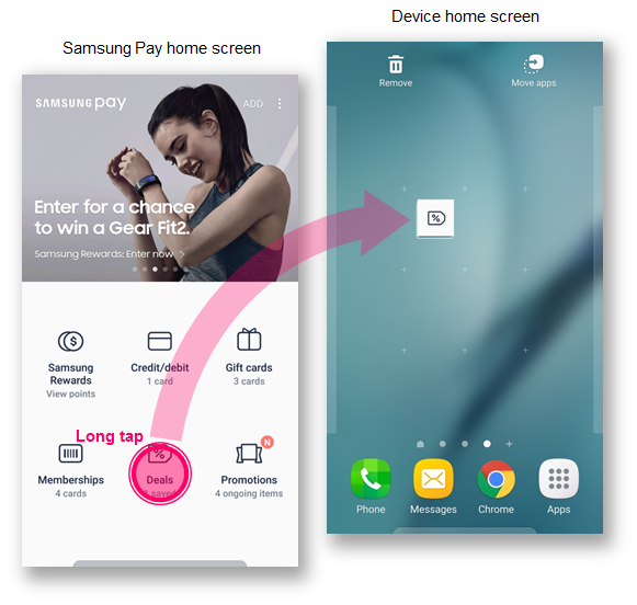
A small downside of switching from a card stack to a grid wall was that it would add one more depth till users can actually see the content. So I suggested that we allow users to create a shortcut on device Home screen by simply tapping and dragging on a feature module for higher accessibility on preferred items. This functionality is currently under internal review.
2. Implementing the change on the global market
The next step was applying the new platform to each of the global markets. I was on the US market and Asian market team.
Task #1: Make quick fixes whenever there is valid feedback
While running a closed beta test in the US market, we learned that users were reluctant to tap the promotions area at the top because it felt like an ad. Our intention was to serve up relevant deals and promotions in this area so that it would work as a hook to bring more people into the app, but with the targeted promotions feature being delayed, it simply came across as an ad banner to the users rather than useful information.
In response to this feedback, we decided to minimize the promotions area and simply provide a blurred image of the promotion to give a hint that there are contents behind the Favorite Cards panel. This quick fix was well received internally and was quickly adopted by other markets as well.
Task #2: Schedule feature updates and design the flows
I worked directly with the local PMs, developers and the business team to figure out the list of features that would be included in each monthly app update. I designed the user flows and wireframes of the new features such as Samsung Rewards and Deals while making sure the flows were consistent and simple.
Samsung Rewards
Deals
Task #3: Make Deals and Memberships more easily accessible
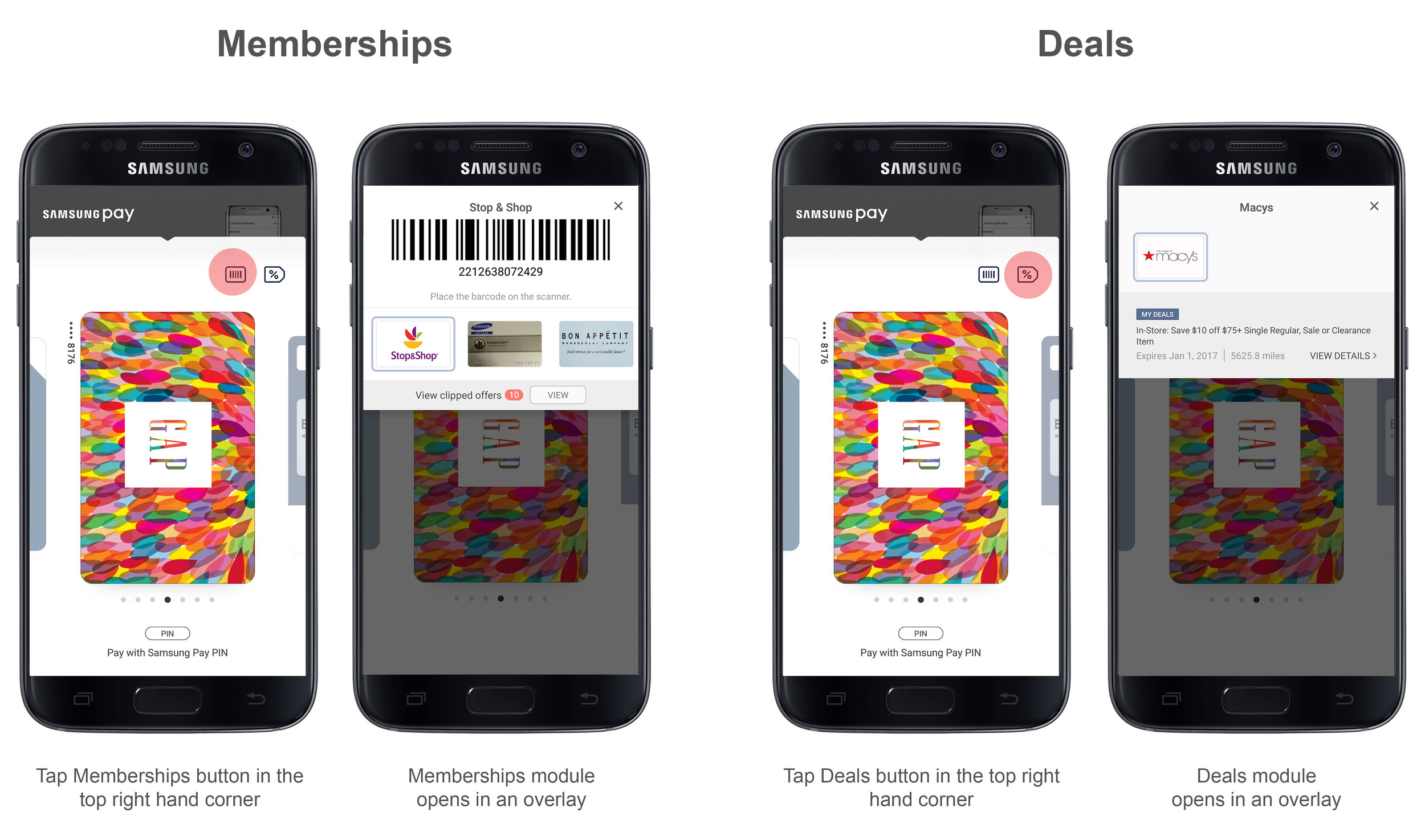
Deals and Memberships are 2 items that are often used along with payment cards at check out. We needed to figure out a spot for these features on the Favorite Cards panel. We carefully studied the behavior of the local consumers and found out that they are not as frequently used as payment cards, but should still be quickly accessible for cases when users need them.
So we decided to keep the card carousel for payment cards only and create a separate space in the top right hand corner for opening Deals and Memberships modules.


