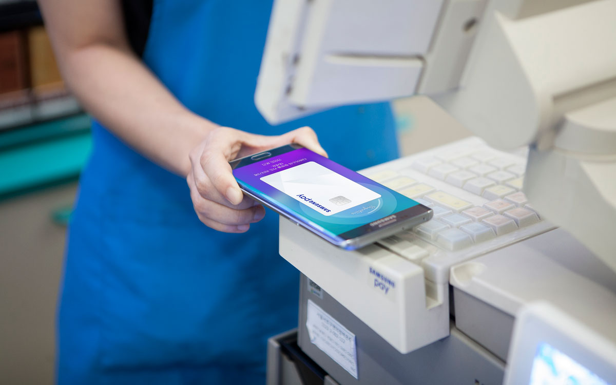
The potential of Samsung Pay lies in the technology called MST, which allows expansion of coverage to just about any store with a credit card reader.
Here's how I made it shine.
The Process
1. Home screen
In-store mobile payment is still new to a lot of people.
Google Wallet and Apple Pay are out there, but people still find it hard to grasp what to do when they first land on the app.
I wanted to make sure the UX felt simple and familiar.
Draft of Home screen
Although the team wanted to go for the card stack like our competitors do, I wanted to keep the Home screen simple and easy to understand by showing one card at a time and giving a single CTA.
I backed up my stance with data stating that users own 3 credit cards on average.
This way it is clear what to do with the app. Open it, scan fingerprint and tag.
2. MST does not support automatic app launch
Although MST has its perks, it has its limitations as well.
As we went into designing the payment flow, we learned that tagging the phone on a credit card reader does not launch the app automatically like NFC payment.
This meant we won't be able to support zero-depth payment.
To come up with a viable solution, we brought back results from our initial user interview.
We learned that automatic launch is not something users are familiar with anyway.
Their original behavior with their physical wallet is that they like to have their credit card ready before facing the cashier.
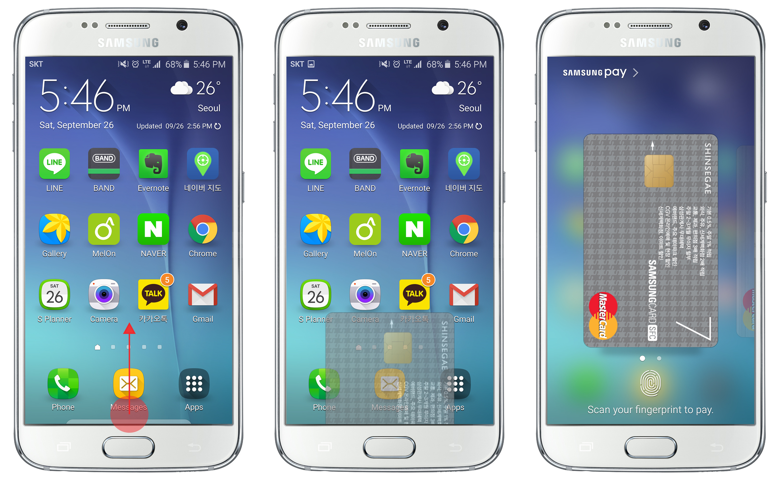
We decided to take advantage of the fact that Samsung is a device company, and create a shortcut that is accessible on ANY screen at a bezel swipe-up.
We named it Simple Pay.
I made sure the transitional interaction feels light and quick by limiting the visuals to a single card only.
Below are the final visuals of Simple Pay on different screens:
1. Screen off
2. Lock screen
3. Home screen
Here's a demo on video:
3. User has to place the back of the device against the reader.
After running on-site prototype testing, we found out that many users place the front of the device against the reader unconsciously thinking that it's the "active" side.
However, the MST coil sits in the back of the device.
Sure we could place a user guide but I wanted users to get the hint in an intuitive way.
Portraying a 3 dimensional action in a 2 dimensional space was not easy, but I managed to come up with an idea where I'd place some sort of wavelength going off in the back of the card to indicate that the transaction signal is being emitted in the back.
Below is how our graphic designer brought it to life.
4. MST does not recognize completion of payment.
Our goal was to keep the user completely unaware of the backend technology such as NFC or MST.
All they need to know is that they can tag their phone on both NFC reader or a credit card reader.
In order to do that we need to keep the payment process exactly the same for both technologies.
However one huge difference is that MST does not receive feedback from POS at the end of a transaction.
And because of this MST has to continuously emit tokens without knowing whether POS has successfully received it or not.
And these tokens mean money for card issuers.
To resolve the issue for the tokens, the team decided to go for a 15 second time-out.
The duration was determined based on on-site prototype testing.
To sync the interaction at the end of transaction with NFC, we thought of all kinds of solutions such as the device grabbing the sound of a receipt printing.
But then I went into on-site prototype testing and realized that users don't really pay attention to the screen past the point of tagging their phone.
The presence of a human being is much bigger than your phone that they naturally turn to the cashier for confirmation.
So I gave my honest opinion. Users won't be able to tell if it's not in sync with NFC payment. Let them just tap the back key to quit or let it time out.
No need to force in another fancy spec to make up for this issue.
Like I expected, we received no complaints from the users regarding this issue so far.
Result
We successfully synced the payment processes of MST and NFC and below is the result.
MST
NFC
App Home
We kept the App Home simple and compact with just the necessary amount of information.


